The Company / Client
Mammoth Metallurgy is a U.S.-based novelty metals brand selling precision-machined tungsten spheres and cubes—minimal objects built around one extreme feature: weight. The brand operates as an in-house product line under Beam Distributing Inc., designed and sold from Virginia, USA. Its identity leans premium-industrial, using clean typography and high-contrast art direction to make an intentionally simple product feel collectible, giftable, and “seriously heavy” across ecommerce touchpoints.
Project Scope & Objectives
Refresh Mammoth’s sphere-focused creative system for ecommerce and lifecycle marketing. The goal was to standardize product photography, build a consistent visual direction for email campaigns, and deliver reusable assets for Shopify PDP updates—balancing bold, minimal layouts with clear size/weight callouts and fast campaign iteration.
My Role
I produced campaign-ready assets across product imagery, email visuals, and short-form motion. This included retouching and standardizing sphere renders in Photoshop, designing email modules and layouts in Figma for rapid feedback cycles, and preparing final assets for Klaviyo and Shopify. I also created AI-assisted “morph-style” motion tests using Sora, then edited and exported optimized GIF loops in Adobe Premiere for email and on-site use.
AI Morph Animations
Using Sora and other AI Apps, we created a series of "morph-style" animations using Sora, editing the result in Adobe Premiere and creating compressed GIFs. Thesetype of GIF animations where used for several platforms, email campagins in Klaviyo and our Shopify hosted website, PDP product image updates.

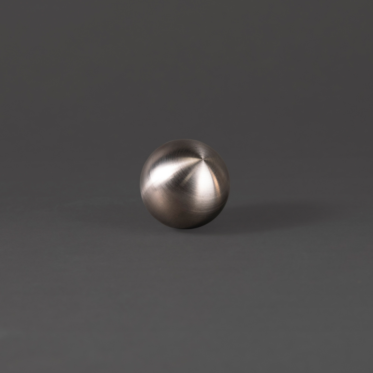
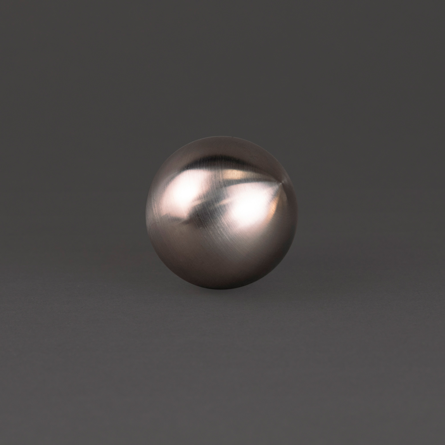
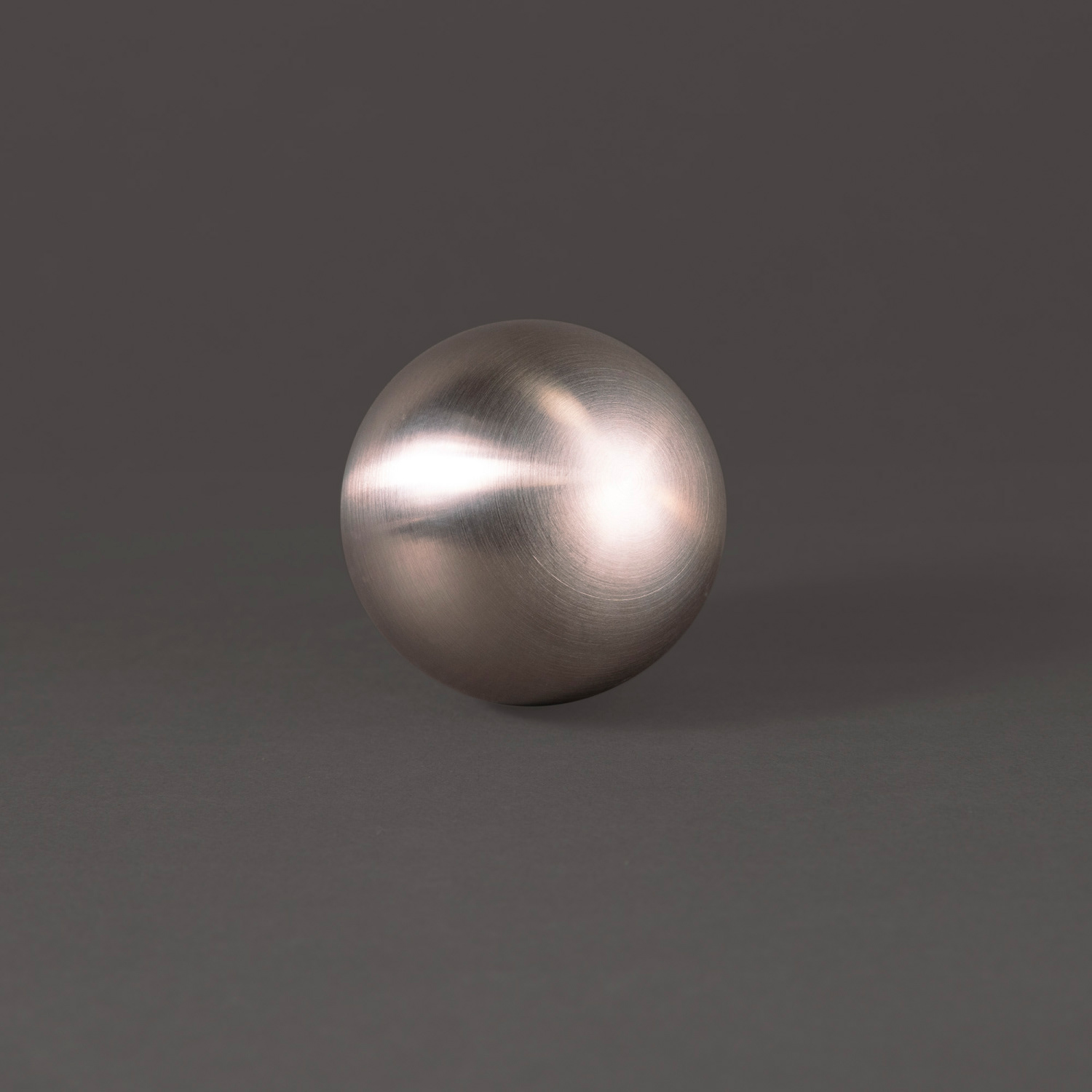
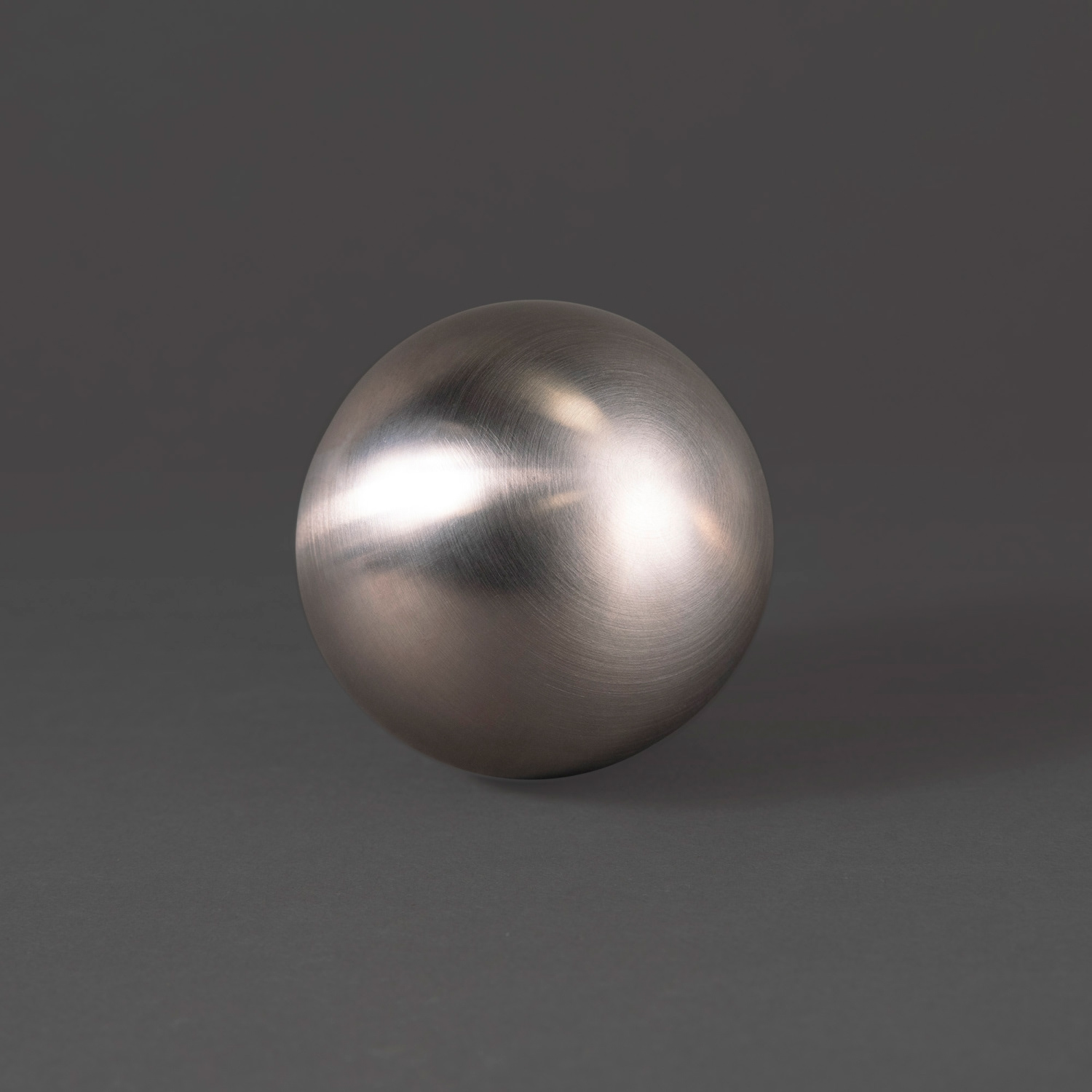
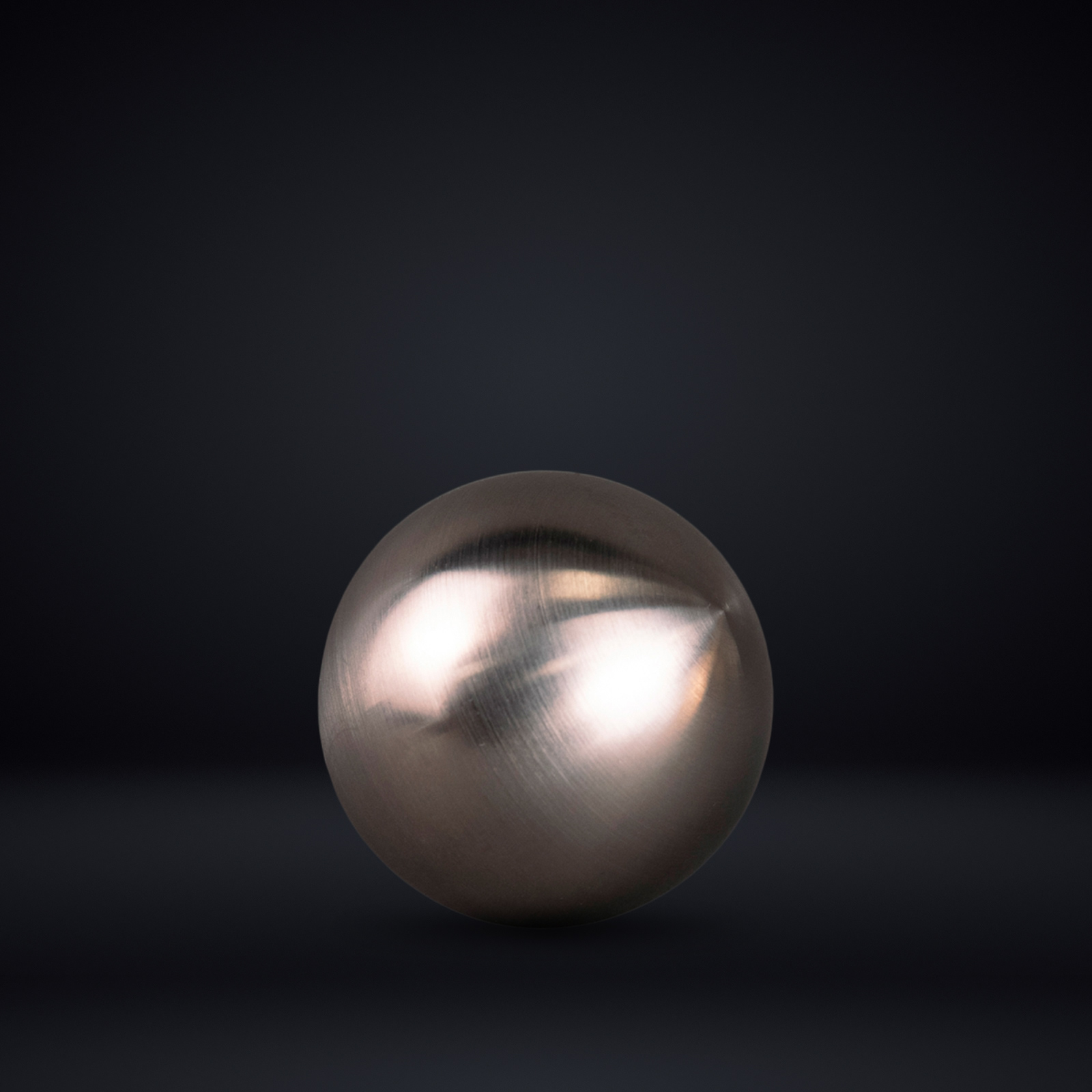
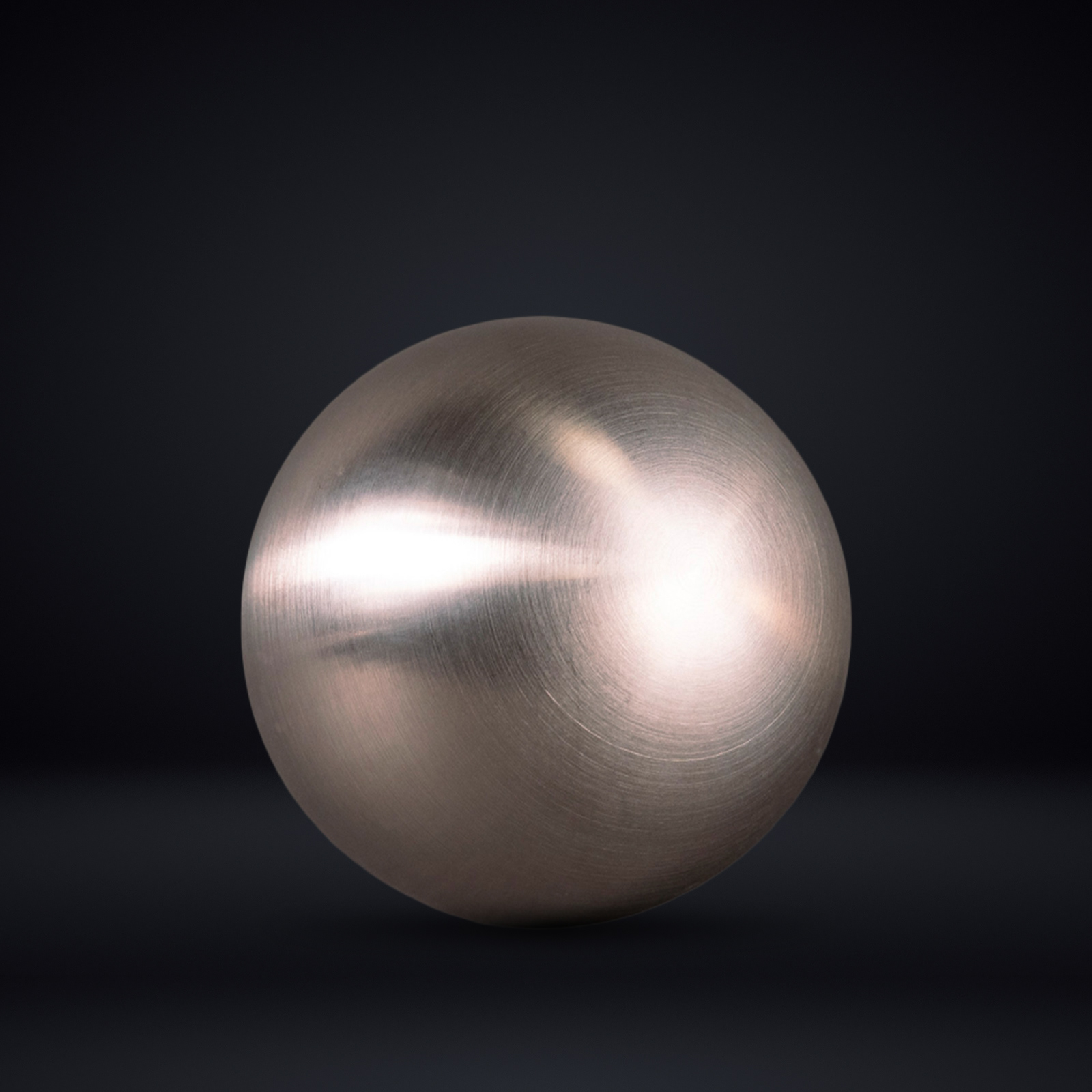
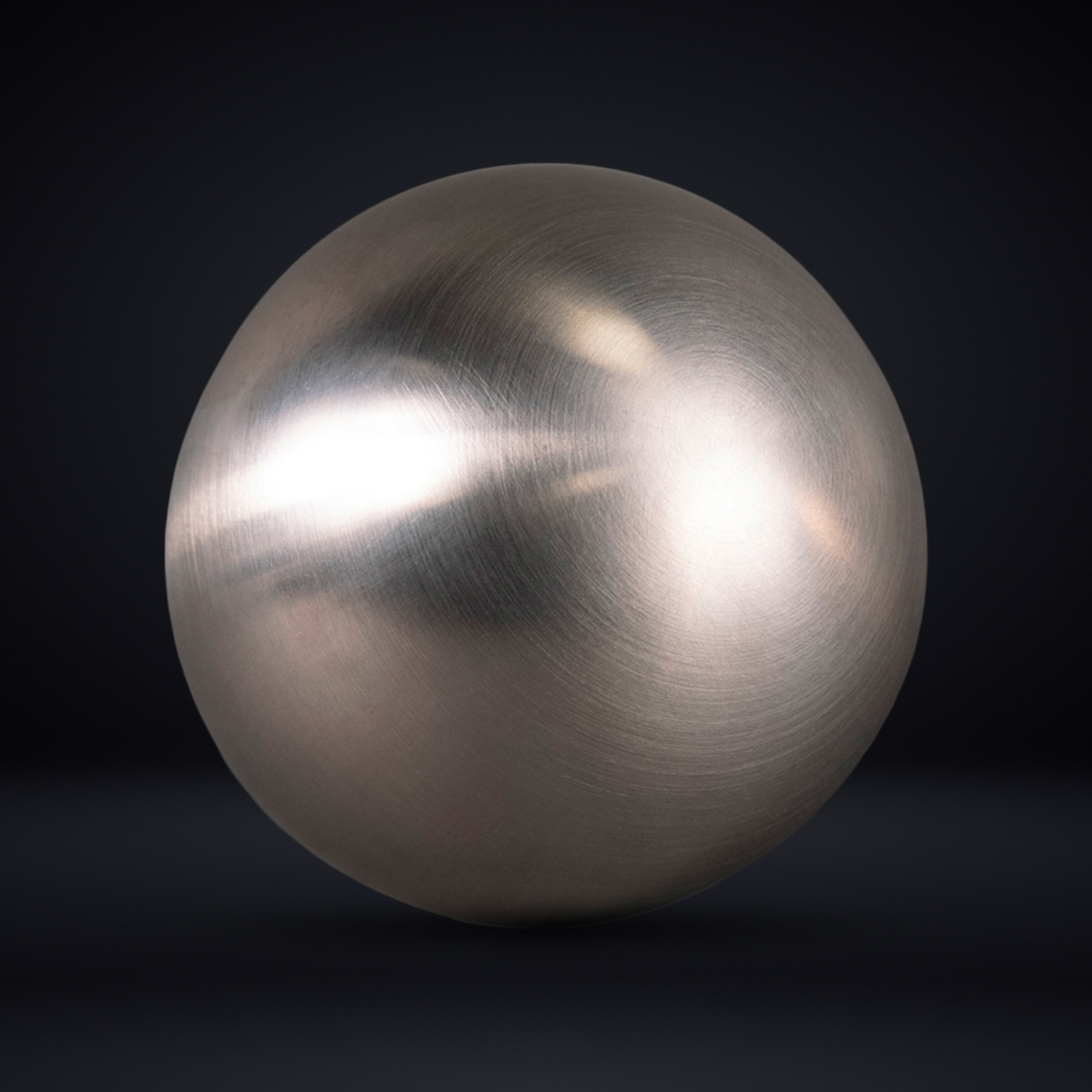
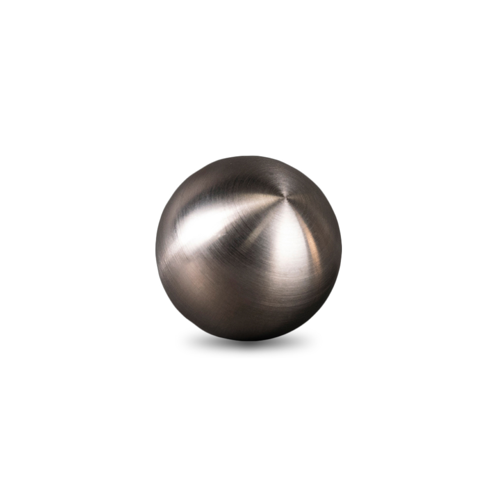
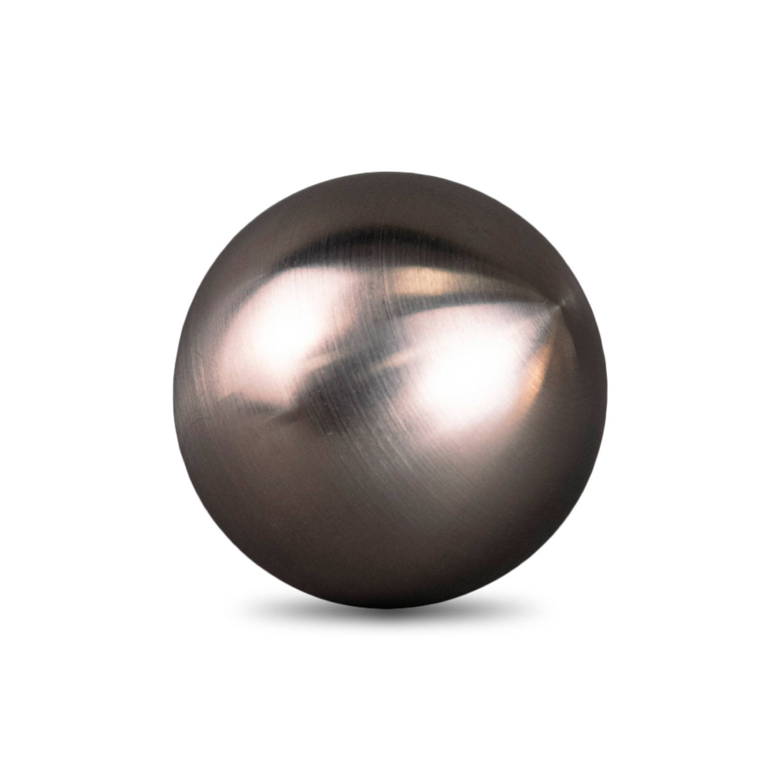
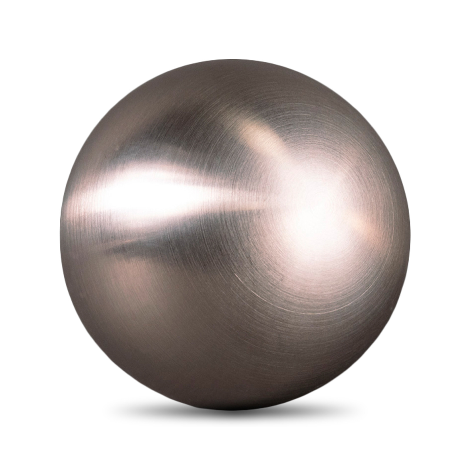
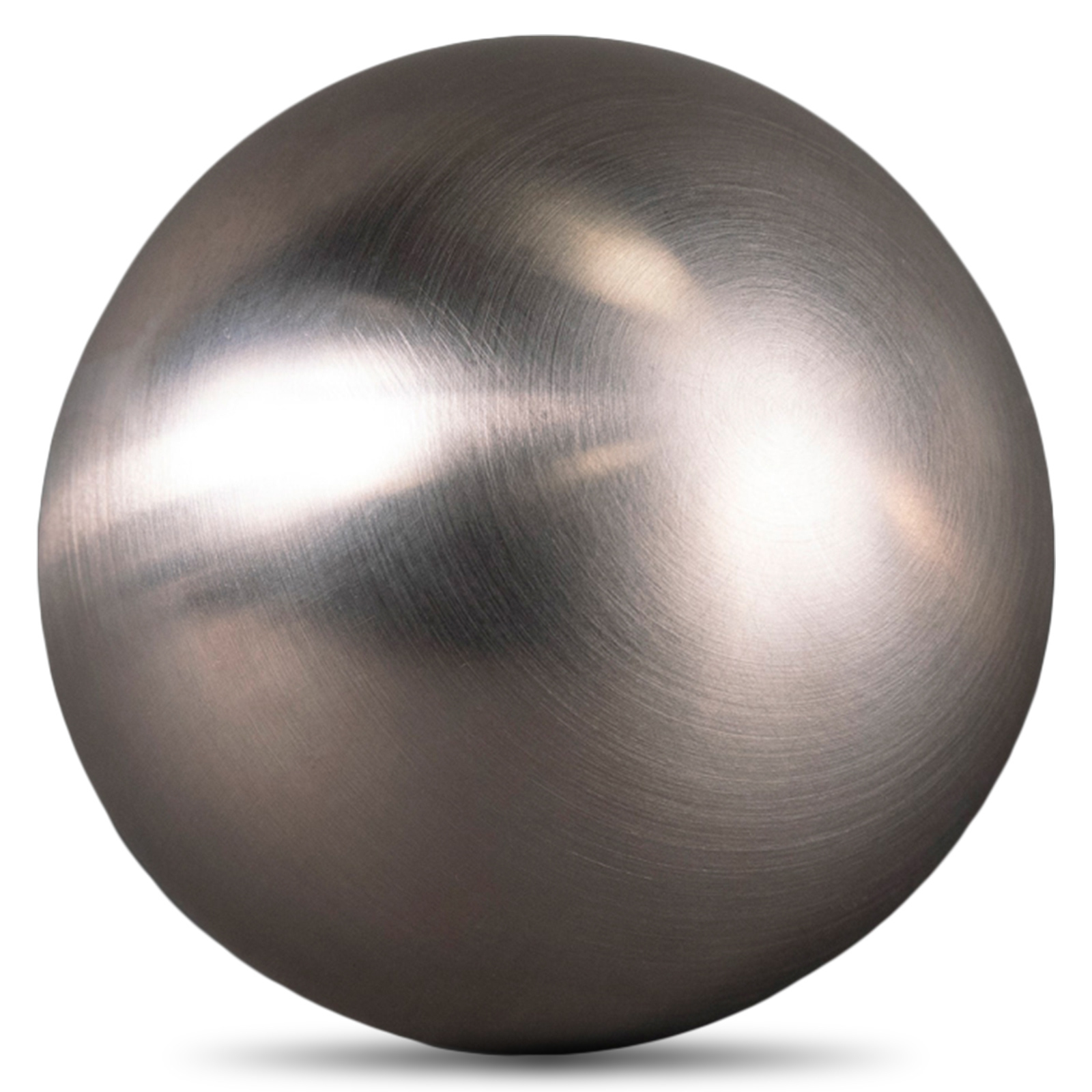
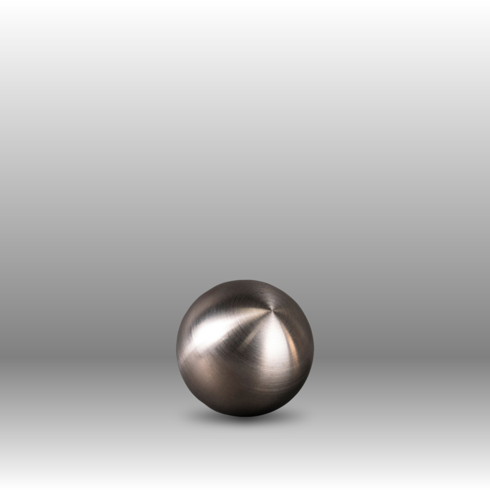
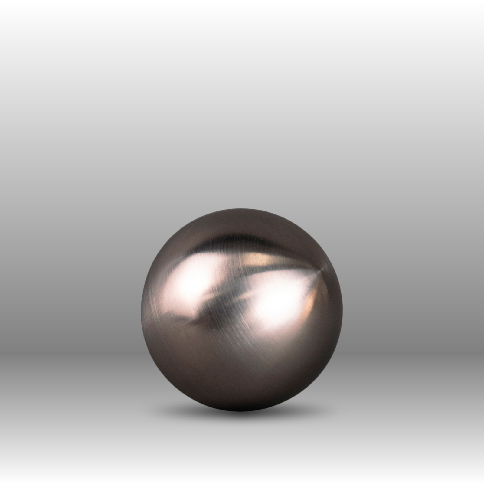
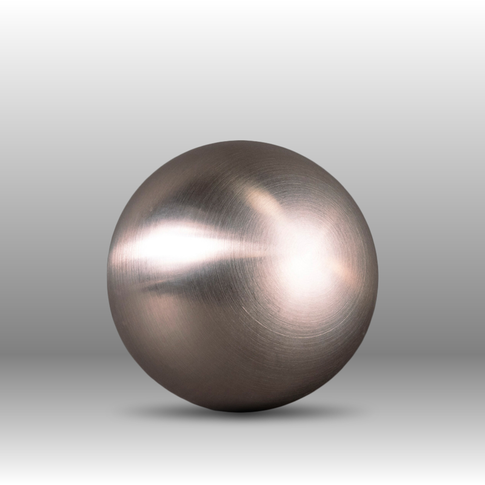
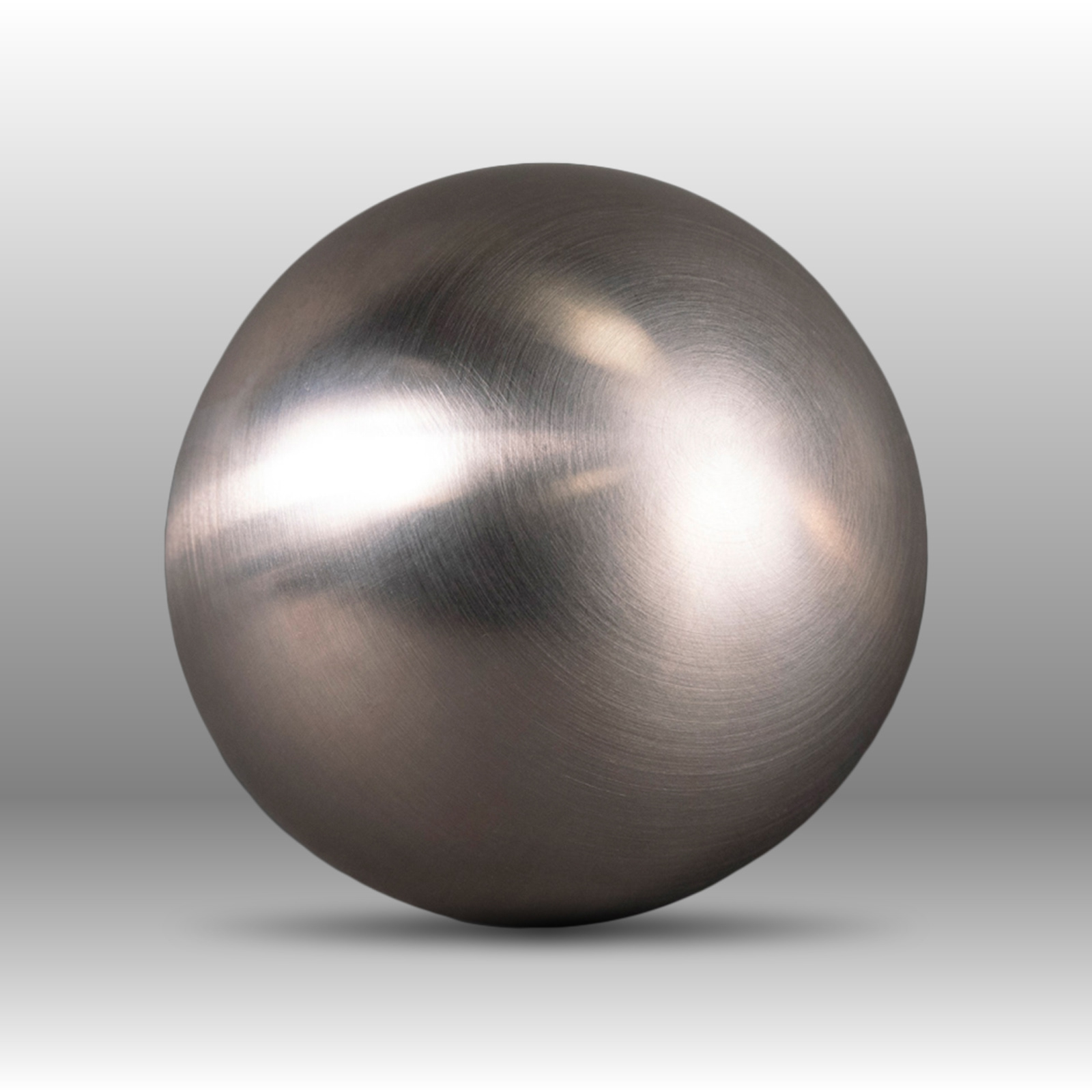
Product Photography Standardization
I built a consistent set of high-end product visuals across multiple sizes and backgrounds to standardize how the spheres appeared online. These assets were used for Shopify PDP updates and email marketing, giving the brand a clean, premium “product-photo baseline” that could scale across campaigns without re-shooting every time.

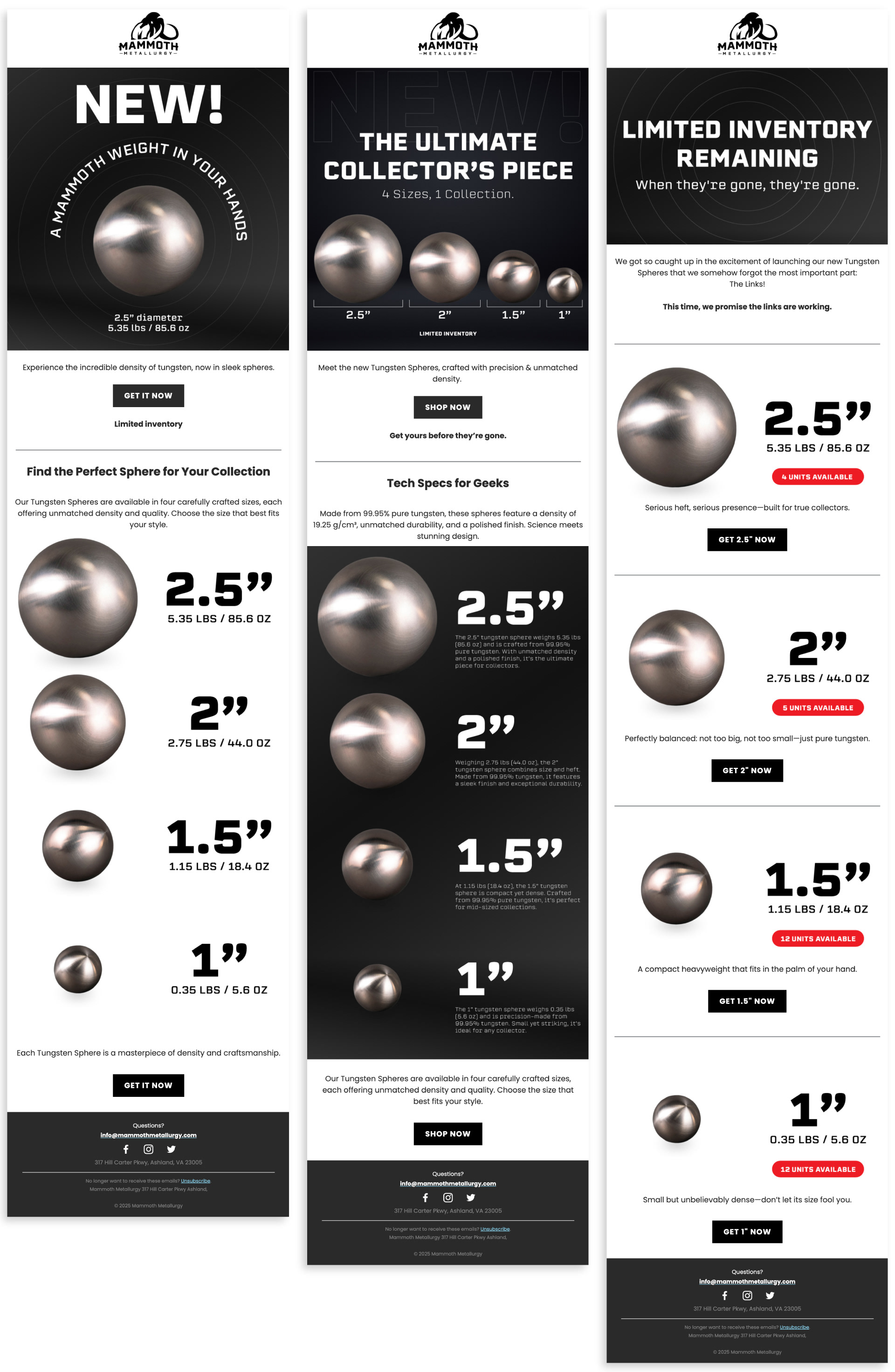
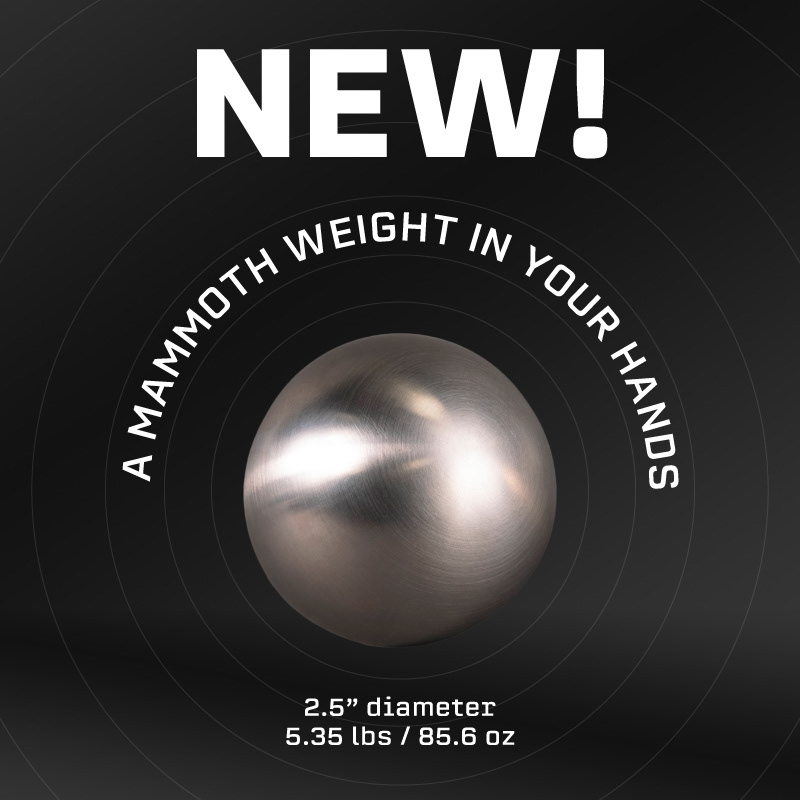
Email Campaign Visuals
I designed a new set of campaign visuals specifically for email marketing, focusing on clarity, hierarchy, and a bold, high-contrast look. Product photos were refined in Photoshop, then assembled into modular layouts in Figma to test headlines, sizing references, and messaging. These assets were iterated through feedback rounds and used across Klaviyo campaigns to support product launches, limited inventory drops, and feature callouts with a consistent visual system.
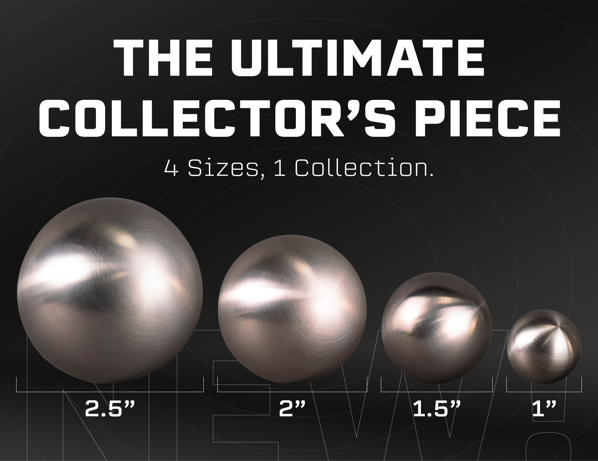

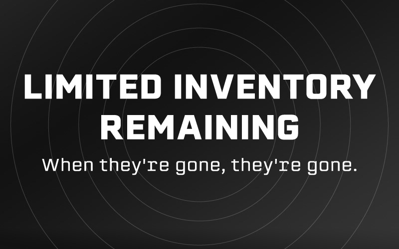
Email Design System
I designed a set of marketing emails focused on Mammoth’s tungsten spheres, refreshing the visual direction with a clearer hierarchy, stronger typography, and consistent product sizing/weight callouts. Each layout was built as a modular system so we could quickly test messaging (new drop, limited inventory, size comparisons) while keeping the brand look unified across campaigns. These emails were used to support sphere-focused promotions and drive traffic back to the Shopify product pages.